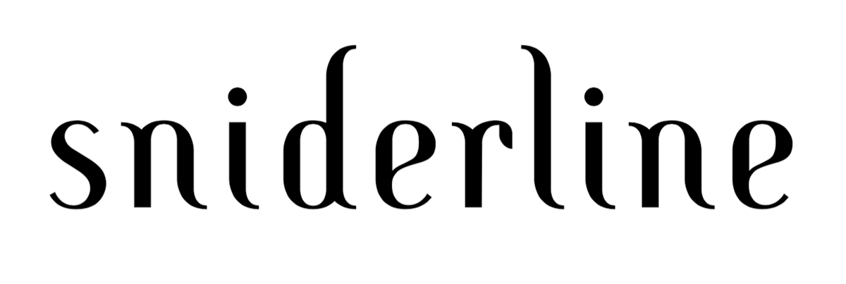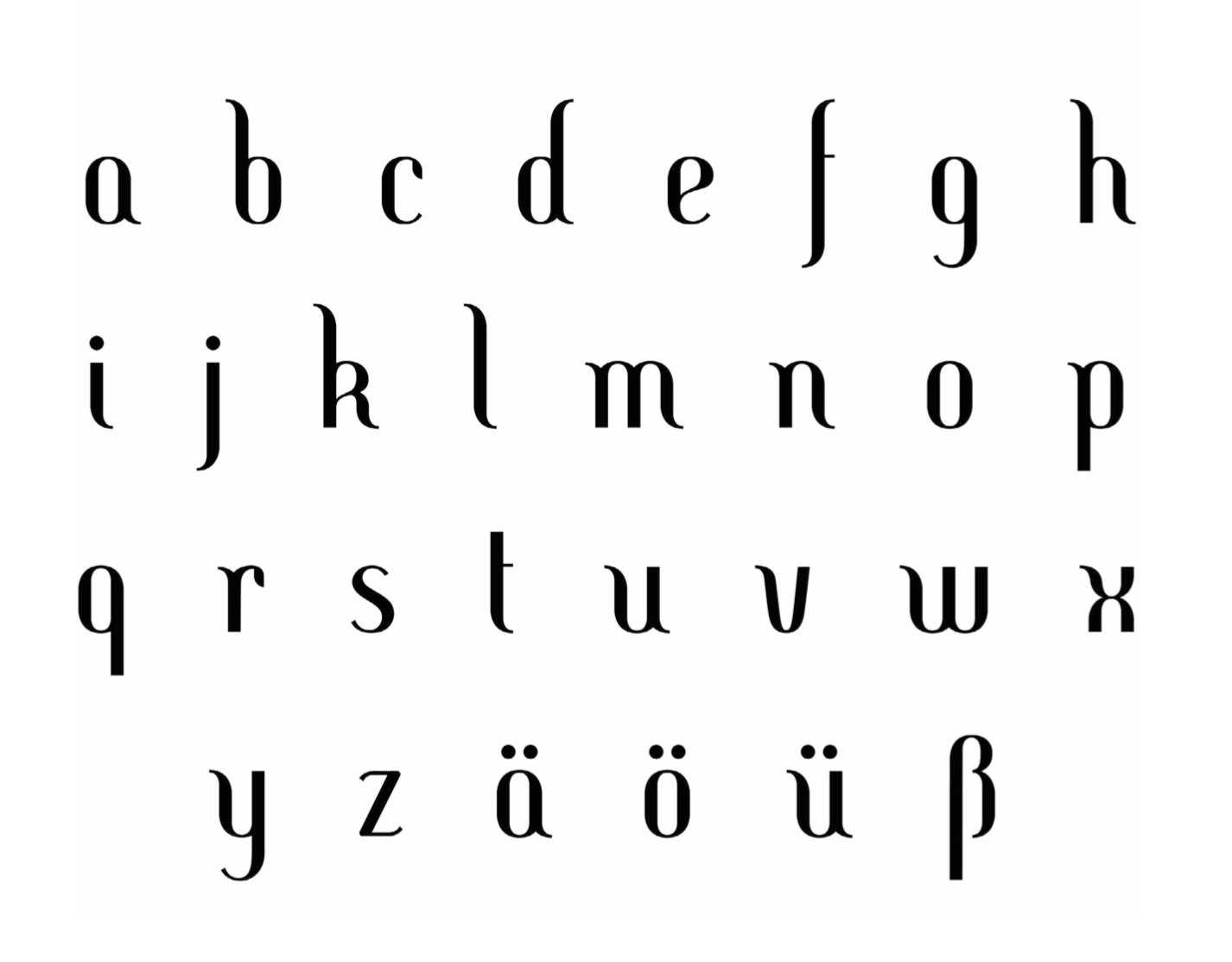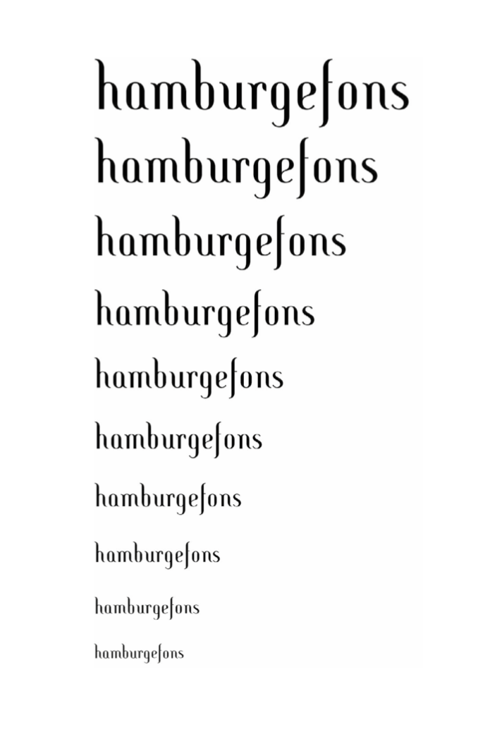


My font “sniderline” is a constructed, classicist antiqua characterised by varying line thicknesses and the round shapes. Due to the vertical axis it eradiates elegance and static calmness. The slanted serifs transmit some kind of dynamic though. Its manifold applicability makes it a font capable of being used in logotypes as well as in layouts. For the purpose of presentation of my font, I created a significant booklet containing various aspects of it and showing it in different sizes. Page after page is getting longer and longer, and with the title of its content at the bottom of each page the whole booklet functions as an index itself.
